Wednesday, 21 October 2009

Visual Language-3D letter

In this visual language session we were creating a 2 dimensional letterform on surfaces which are on different planes. ach group had to breing in a number of boxes ranging from a size of a matchstick box to a shoe box. We then arranged the boxes to overlap each other when looked atthrough a view finder the boxes then will look like a flat plane .


The aim of this project is to creat a letterform that, if you look at it through one particular angle it will look like a 2D letterform , in this case, the letter M .If you move from that point and look at it in any other angle the letter will become unrocognisable.

This was a group brief and i would have probably been impossible to do by yourself. We constantly needed someone to be looking at the work through a view finder and guide another person to place the right mark on the right box.


Our way of tackling this was to take of a photograph of the arranged boxes looked through the view finder and then photoshop out letter over the image and then print it off.

From looking at the photograph we can then identify which boxes contain which part of the letter form.
We started off by drawing an outline of each part of the letter onto the box and then sticking pieces of black card cut into the shape needed over the outlines.

This was the final outcome ( it was unfinished as we didnt have enough time)

p


Tuesday, 13 October 2009

Visual Language (third session)

Today we had to create five visual variations of the word Scale on five 10x10 cm squares. After that everyone had to chnage seats leaving their five squares and obtaining 5 new ones which had been done by somebody else.

With the new five squares that we had, we created 15 more 10x10 cm squares. We had to make 3 furthur variations of each of the five squares.

Here are the examples of what I achived. on the first horizontal like is the 4/5 squares I obtained from someone else and going down in columns are the 3 variations of those squares.


Visual Language Group work


In our first Visual Language session, as well as the individual work we were put into groups to produce another visual interpretation of a chosen word. We were given the same range of words as we were for the brief alphabet soup pt1. and this time the group allowed to choose a word. We chose Deconstruction. The contraint of this brief was only using the 26 alphabets from one typeface.

Monday, 12 October 2009

How to...feel at home in a new city?

This "How to"... brief was our first one of the course and it was also a group brief. We were all put into a group of 5-6 with the people that we've not met or have only just met. We were given a problem to solve and our one was to answer a question of " How to feel at home in a new city "


After a session of brainstorming, we came up with the idea of bringing your own home into the city and then we decided to go with a make believe solution rather than an actual solution. How solution was a product called "home in a box" the idea behind it was a box that contains a smell of your own home and if anybody who is missing home smells this box they get the sense of comfort that they would have when they were back at home and this would help them settle down into a new city. We decided to create campaign for this product and came up witht two posters.
Both the posters contain the same format and written information on them. The first one just contains a picture of the box and therefore is mainly informative.
Both the posters contain the same information of what the box does and how to obtain one and also the logo!.


In this second poster, there is more an element of the product being advertised. We chose to help our "customiers" visualise how it would feel when they have one of our " home in a box".
For both the posters we chose the appropriate style to our campaign and these two posters are what we came up with as you final solutions.

Alphabet Soup 2

For this project, we have to design a typeface for a full alphabet and glyphs that represents the character of our partner. Everyone was put into pairs by the "ramdomiser" and I was paired up with Sophie Herring. We were given a set of questions taken out of the Guardian's Q&A section and used them to intrvie wour partnet.

I also asked Sophie a few more questions that were more directly about her personality and character and along with the answers from the interview i started brain storming.
With some of the answers it was quite difficult to visualise them so I chose to concentrate on those aspects of Sophie's personality that I could visualise as an image.

The four words that I used to base this typeface on were playful, subtle, patterns and time. And the time that my new typeface will orginate from is Bell Gothic Std

I also looked at some playful typefaces that I may want the style of my newly developed typeface to be similar to.
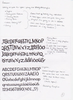


After some research ont the already existing typefaces and imageries associated to Sophie's characteristics and likes (time travelling, patterns, etc.) I started drawing and experimenting wiht combining those imageries to a tpye.
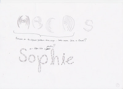


I decided that I didnt want my type to be image based but more like an actual letter. So I started to work from the original type and modify it into my own rather than the other way round.

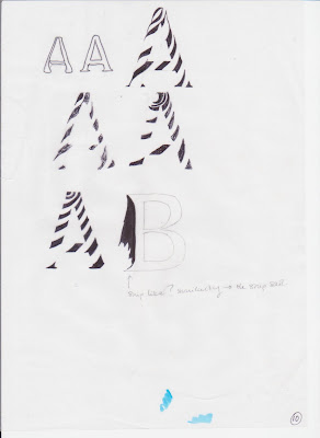
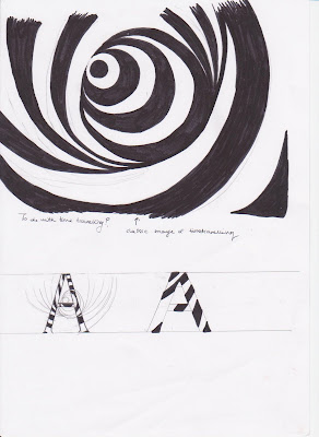
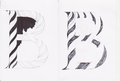
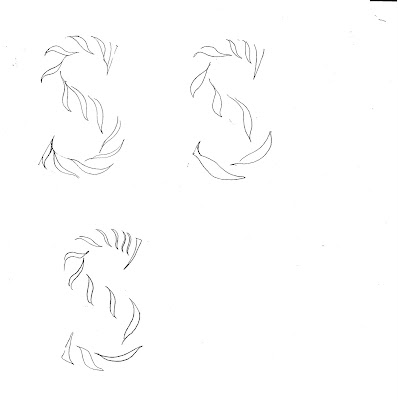
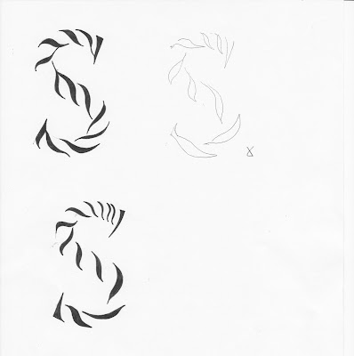
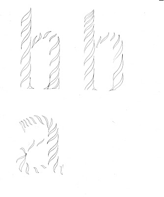
At this point I decided to go with the striped type which works around the typeface, Bell Gothic. The stripes on these letterforms represent quite a few characteristics of Sophie ( patterns, stripes, zebra prints and a time warp for time travel), but mostly the classic image of a time warp that you can see in old films about time travelling. I also really liked the rope-like texture that the type has, that can also relate to piracy and it makes the shape of the letterforms more interesting and playful.

Before finalising my idea I went back to the playful typefaces I first looked at and used them to helpo me create the serifs for my typeface. I think by adding the serifs it makes the letterforms less formal and more friendly.
I decided to go witht he serifs i drew down as they symbolise a ships sail for pirates. I also thought about adding a siluette like drawing onto the letterforms to symbolise the worn out flags you associate pirates with.
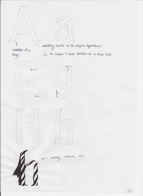
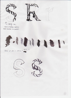
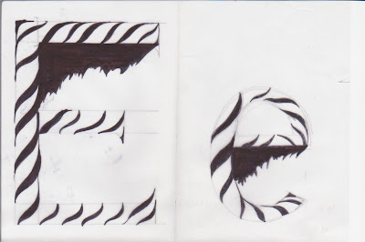
At this point the final design for my typeface is almost finished, there are only a few more alterations that I still have to consider.
Wednesday, 7 October 2009

Visual Language: from(sequence of) 4 to 1...

In the same session, we had to produce a visual representation of the same five words but this time, instead of in a sequence, we were to produce just one 10x10 cm square for each word.


Hybrid

Edit

Duplicate

Disect

Compress

Visual Language: Seqeunce

In the second Visual language session, the task we were given to was similar to the ones before but in this one we were to produce a sequence of four 10x10 cm squares to visually communictae each given word. We were to produce these visual interpretations, again using only the letterform A in diffrence typefaces. The five words we were givne were Hybrid, Edit,Disect,Duplicate and Compress.


Hybrid

Edit

Disect

Duplicate

Compress

Sunday, 4 October 2009

Alphabet Soup Pt.1 Final Piece


These are the final ten letters that I produced to visually communicate the word Edit. The choice of letterforms were purely based on how visually engaging each individual letter looks. Some letterforms that contains a lot of vertical and horizontal lines were very boring (eg. I, T, E) Therefore these is no sequence to it, a choice for one lettr does not affect the other. I was more concerned about how the letterform look as an individual. But also I think once I've placed them all next to each other, they all work rather well.